404 Error
Not Found
Error: We are sorry, but the page you are looking for can't be found.
Please use the search below to find the article you were looking for.
Search
Search Results
 / May 26, 2026
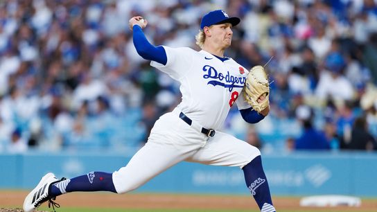
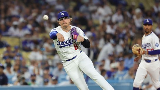
Emmet Sheehan delivers gritty start in Dodgers' Memorial Day win
By Fredo Cervantes at Dodger Stadium
May 26, 2026
 / May 26, 2026
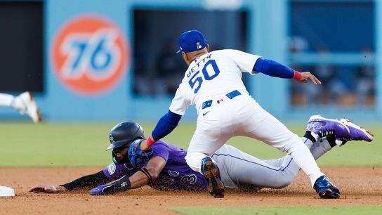
TST Images: Dodgers defeat Rockies, 5-3, at Dodger Stadium
By The Sporting Tribune at Dodger Stadium
May 26, 2026
 / May 25, 2026
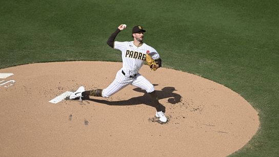
Coming up empty early costs Padres, Canning in loss to Phillies
By Eric Evelhoch at Petco Park
May 25, 2026
 / May 25, 2026
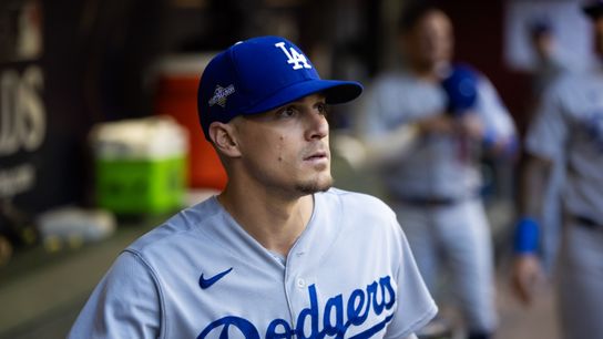
Dodgers Notebook: Kike Hernández returns, Dave Roberts provided injury updates
By Fredo Cervantes at Dodger Stadium
May 25, 2026
 / May 25, 2026
TST Best Bets: May 25, 2026
By Timothy Hessen in Los Angeles
May 25, 2026
 / May 25, 2026
Series Preview: Kiké Hernández set for season debut as Dodgers host Rockies
By David Martinez at Dodger Stadium
May 25, 2026
 / May 25, 2026
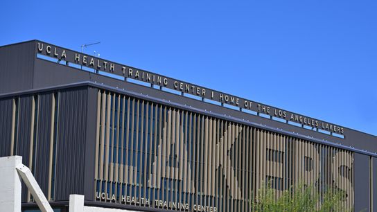
Lakers hire former USC rocket scientist Rohan Ramadas as assistant general manager
By The Sporting Tribune in El Segundo
May 25, 2026
 / May 25, 2026
The break LAFC needed and the test that awaits
By Holdenn Graff at BMO Stadium
May 25, 2026
 / May 25, 2026
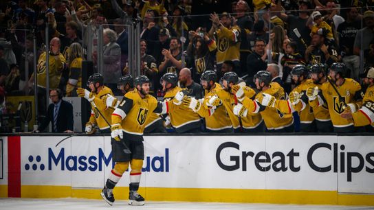
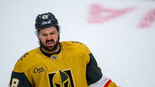
Golden Knights stage comeback for the ages
By Steve Carp at T-Mobile Arena
May 25, 2026
 / May 25, 2026
Tillman wins it late to send LAFC into the World Cup break on a high note
By David Martinez at BMO Stadium
May 25, 2026
 / May 25, 2026
Golden Knights rally in Mark Stone’s return to sit at edge of immortality
By Derek Hegna at T-Mobile Arena
May 25, 2026
 / May 24, 2026
Reid Detmers hits new career-high in Angels' walk-off win
By Jack Haslett at Angel Stadium
May 24, 2026
 / May 24, 2026
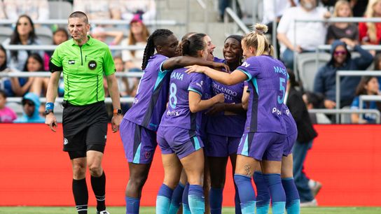
TST Images: Orlando Pride defeat San Diego Wave, 1-0, at Snapdragon Stadium
By The Sporting Tribune at Snapdragon Stadium
May 24, 2026
 / May 24, 2026
TST Images: Angels defeat Rangers, 2-1, at Angel Stadium
By The Sporting Tribune at Angel Stadium
May 24, 2026
 / May 24, 2026
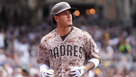
TST Images: Athletics defeat Padres, 5-2, at Petco Park
By The Sporting Tribune at Petco Park
May 24, 2026
 / May 24, 2026
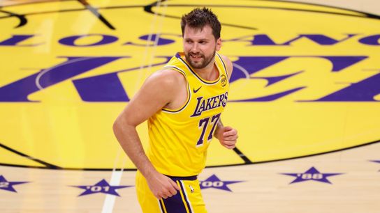
Luka Dončić Earns First Team All-NBA Honors
By Carlos Yakimowich in Los Angeles
May 24, 2026
 / May 24, 2026
Straight Talk: Yamamoto's ground game tops aggressive-swinging Brew Crew
By John E. Gibson at American Family Field
May 24, 2026
 / May 24, 2026
Orlando edges San Diego Wave FC 1-0 at Snapdragon Stadium
By The Sporting Tribune at Snapdragon Stadium
May 24, 2026
 / May 24, 2026
Antonelli wins Canadian Grand Prix as Russell DNF's
By Jim Precourt in Montreal
May 24, 2026
 / May 24, 2026
Dodgers take series behind Yoshinobu Yamamoto's strong outing
By Fredo Cervantes at American Family Field
May 24, 2026


